Other than the visual design, determining how a user will navigate a website is one of the more challenging creative tasks that you’ll face as a web designer. The main goal is to make people feel in control of the site and capable of getting around quickly and efficiently. Nothing is worse than a user feeling lost in your site.
To help people get around and stay oriented, your navigation scheme must be a road map of the entire site, complete with “you are here” signs.
Global navigation for websites
Remember the famous line from the 1970s TV commercial: “How many licks does it take to get to the center of a Tootsie Pop?” With candy, the more licks, the better. On the web, however, the opposite is true: Users won’t find anything tasty about navigating through gobs of pages. Your goal is to get users as quickly as you can to their desired content.
The best way to reduce the number of clicks is to provide your primary, secondary, and tertiary navigation sets on each page of the site. This strategy, called global navigation, enables people to quickly navigate from one main section to the next without needing to retrace any steps. Additionally, it’s important that these navigation sets are always located in the same place and do not change what they offer (swapping navigation options in and out). This consistency provides a mental anchor for the user.

Credit: © Apple, Inc.
Apple’s global navigation system allows users to stay oriented and to quickly traverse from one section to the next.
Section navigation
After users select a category from the primary, secondary, or tertiary navigation group, they’re transported into a section. Assuming that the section has a few levels of content within it, you need a way to navigate through it. A typical practice is to reveal a set of section navigation choices on the page. These choices are unique to their section, but the region you select to display them is the same region used to display section navigation for other areas of the site.

This section navigation design reveals the first level of pages in the Products area of the website.

This section navigation design reveals first- and second-level pages in the Products area.
Alternatively, you can display the section navigation fully opened. The advantage is that users can quickly see all the first- and second-level content with a section. The disadvantage is that the navigation can take up a lot of room and may look cluttered and overwhelming to the user.

Section navigation is often shown as a drop-down menu as well as on the page itself.
Typically, just the first level of pages is shown, but flyout menus can provide quick access to second-level pages. It is okay to have redundant section navigation, showing it both on the page and including it as a drop-down menu in the global navigation system.
Leaving a trail of bread crumbs
If Hansel and Gretel can use a trail of bread crumbs to find their way back through the forest, just think of what a digital version of bread crumbs can do for visitors to your website. Bread crumbs, as they’re actually called in the web-design industry, are text links you leave in a trail that marks your steps as you go deep into a section.
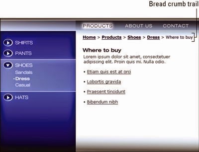
This bread-crumb trail provides a convenient way to retrace your steps in a site.
Bread crumbs are helpful to navigate sites that have navigation that goes more than two levels deep within a section. For example, if you use the section navigation to go down to a page that has even more links on it, you are now diving into a third or fourth level of the section’s hierarchy. It’s just not practical to display third- and fourth-level navigation on the page. So the bread crumbs can simply record your steps and get longer and longer as you dive deeper (hopefully no more than four levels or you’re getting into the catacombs of the site!).
Each bread-crumb link provides a quick way to retrace your steps back up the hierarchy. You don’t have to follow the links in sequence; you can click any link in the trail to jump quickly back to a different level in the hierarchy. The trail also gives you a good idea of where you are in the site. Unlike with a global navigation scheme, however, you cannot jump across to another section; you can only jump back to a level within a section. Think of a bread-crumb system as the browser’s Back button on steroids.
Graphically, the design convention for a bread-crumb interface is to show each previous step as an active text link followed by a character (arrow, colon, or pipe), all in a simple row. The last entry at the end of the trail represents the current page you’re on, so it should not be a link — and it should look different. If it were a link, it would simply reload the page — not the ideal user experience.
ليست هناك تعليقات:
إرسال تعليق